Showing posts with label Tutorials. Show all posts

Tuesday, November 25, 2008

HDR Photomatix Tutorial

sAlright so here it is. I dug this up from my hard drive. This is actually one of the shots that didn't make the cut due to camera shake. So it's gonna be a little soft but it should do for now. Here's a little tutorial on how to use photomatix to merge 3 exposures into 1 HDR image.

First of all, you're gonna need to have 3 shots of the same thing but on 3 different exposure times 2 stop apart. What is 1 stop you ask? Turn ur DSLR mode dial to manual and then look into the viewfinder, and you will see a bar. The bar represents the exposure of the scene. To the left is overexposure and to the right is underexposure, the middle is the optimum exposure for the current scene you metered off from. For those that have a camera which supports bracketing. Use that.

One stop is the equivalent of exactly three flicks of the exposure dial. Make sure you have a tripod for this and use a remote or timer if you don't have one. So once you have the three shots it'll look something like this. Oh yeah! I almost forgot. Shoot in RAW!!!!

Underexposed -2

Optimum Exposure 0

Overexposed +2

Now fire up photomatix. Click on Generate HDR Image button and a small window will pop up. Browse for the 3 shots you just took and load all three of them. And now just follow these screen captures for the rest of the steps.


You can play with the sliders and see which one suits you best.

So here's what I got from photomatix. this is a pretty bland shot actually cuz I prefer adding the extra punch in photoshop. You can sometimes get pretty decent HDR photos straight from photomatix. As for me here's what I did to spice it up a bit. This one's pretty bad. I would suggest taking shots with an aperture of f/8 and above for sharpness. I took these on f/3.5 so I lost a lot of detail.
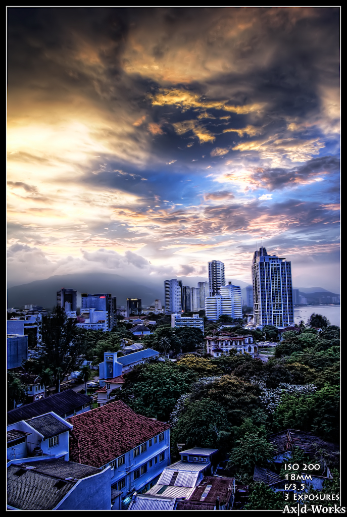
And there you go. The basic steps to get your first go at HDR photos. :D Happy experimenting!!

Friday, November 21, 2008

DSLRs 101 - Shutter Speed

For today's topic I will explain what shutter speed is. This one goes out to Hariz :D Okay so what a shutter speed does is control how fast the shutter opens and closes to reveal light to the camera sensor. The faster the shutter speed, the less light reaches the sensor which also means less time for the camera's sensor to collect all the light data.

Usage :
There's not really a definite rule to follow, because photography is a very subjective thing and it's up to you how you want to present your vision. But the basics are, faster shutter speeds are used to freeze action. You will get sharper pictures too. For this to be in effect you should generally use nothing less than 1/500s for best effect. But the downside is that you will only be able to do this in very brightly lit environments. You could counter this by using flash or multiple flashes. But that's another topic entirely.

So here's an example of an action-freezing shot. Shot on ISO 200 at 1/800s under the midday sun at f/5. Apertures also play an important role in your photos. But I will explain this at another time. So as you can see I froze this quite nicely. Everything is clear and no motion blurs.


Next off!! Low shutter speeds. Low shutter speeds are usually used for low light photography or for more artistic approaches. There are a lot of things you can do with long exposures. Light painting, light trails, motion blure, etc. But basically its used for low light shots. Here's an example of one. Shot on ISO 200 and 3 second exposure time at f/4.5. Make sure you have a tripod on for these kinds of shots.


And now I'll show you a creative way to use a low shutter speed. I took this at ISO 800 and at the shutter speed of 1/20s to get more of the background in since it's pretty dark and have some light trails by swaying the camera around as i press the shutter button, but at the same time freeze the action. So all I had to do was use my SB-600, set it on manual, around 1/16 if I remember correctly and set at a zoom of 85mm.


So that's it from me. :P If you're ever in a bind you can always google it. But if you can't find what you're looking for you can ask me. I'd be happy to help. :)

Monday, September 22, 2008

Adobe vs sRGB with photo comparison!!

This debate on which is better and which to use has been going on for ages. I used to be on AdobeRGB before, back when I was shooting HDR's and tweaking the colors in photoshop. But nowadays I just stick to sRGB after doing some personal tests of my own on how much do I really lose out if I use the sRGB profile as opposed to the AdobeRGB color profile.

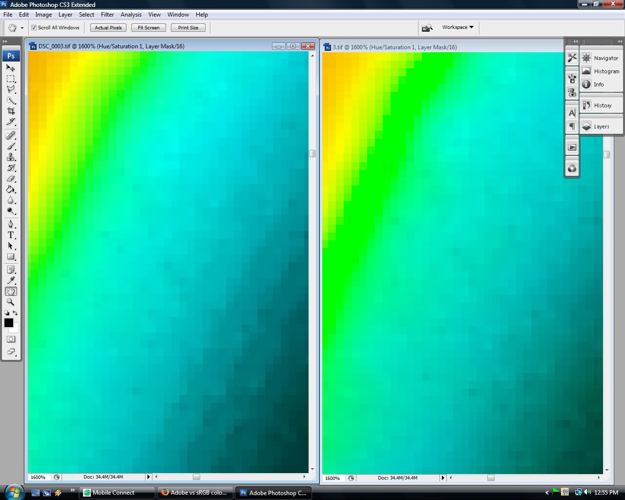
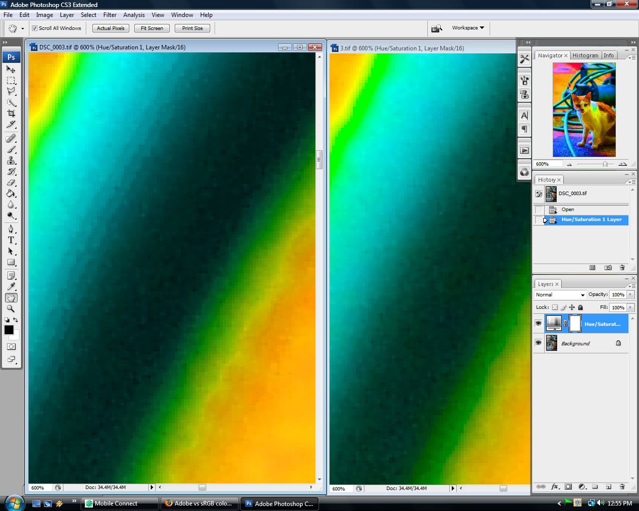
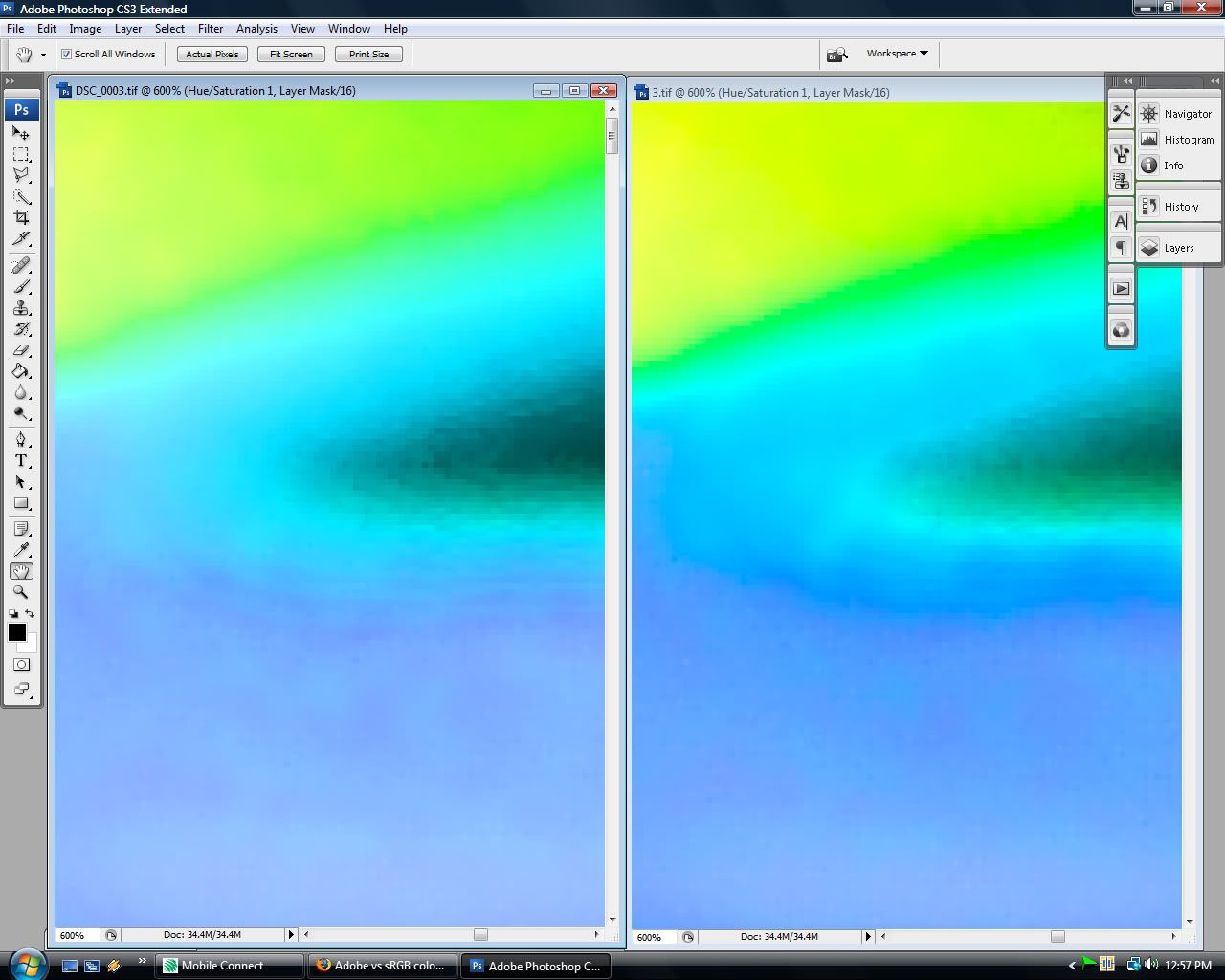
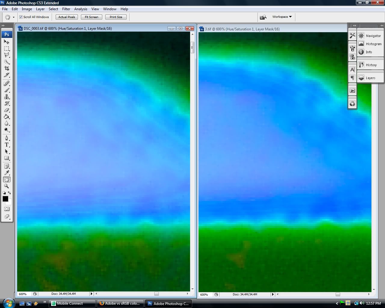
This test is done with a photo of my cat. Shot in RAW format. Tagged and saved one file in sRGB and the other with AdobeRGB in 16bit TIFF format. I loaded both of them up in photoshop and made sure that both are zoomed at the same spots.

I applied a HUE/SATURATION adjustment layer on both files and pushed the saturation to 100. I then zoomed in to colors that the AdobeRGB color profile claimed to be superior compared to sRGB which looks to be the greens, yellows and some purple/blue. Here are the results.

The left side is in sRGB while the right is in AdobeRGB. So as you can see, there is truth that the AdobeRGB has more color gamut. And the transitions between colors are smooth, whereas the sRGB profile's color transitions aren't as pretty.

But then again I have to ask you. How often do you raise your saturation to the point of posterization and does that tiny bit of improvement in color gamut worth the extra hassle of calibrating your monitor and converting back and forth between color profiles to get the right color on screen and on print? And also that these are 600% and 1600% crops!!!

This is by no means a scientifically proven method of comparison. But I just wanna show you how little you'll be missing out if you decide to ditch the AdobeRGB color profile and opt for sRGB. :D


Saturday, September 20, 2008

LucisArt Tutorial. Get that Dave Hill look.


I'm feeling generous today. So I did this last night. I love playing around with stocks. It really helps when you have relatively good photos to begin with that has some kind of mood and lighting.

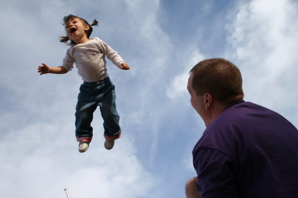
So we're gonna be changing from this


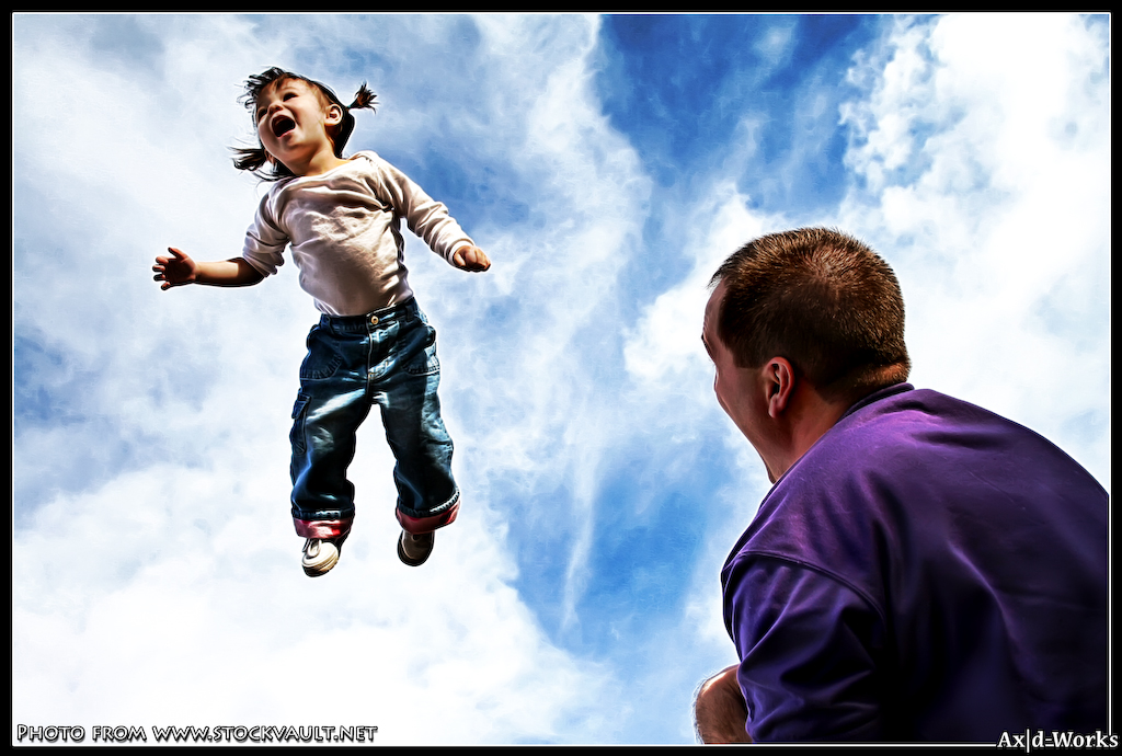
To this

Got you're attention yet? :P Take note that this workflow is specifically for this photo to give you a feel of how to use the LucisArt plugin.

Alrity here we go. First of all, download the stock photo from here http://www.stockvault.net/download_file2.php?pid=8019

1. first step after opening it up in photoshop is to duplicate the layer, and use the CLONE STAMP tool to get rid of that flag pole or something below that kids' feet.

2. Next add a CURVES adjustment layer and click on auto. Paste merged by holding CTRL+A followed by CTRL+SHIFT+C and then CTRL+V.

3. Now fire up LUCISART, set it to SCULPTURE 20. Fire up LUCISART again and do the same thing for the 2nd time. Now we've got the "look" but the color's flat. So next off we're gonna add more vibrancy.

4. Duplicate the current layer add a HUE/SATURATION adjustment layer and pull the MASTER SATURATION to around 35.

5. In the same HUE/SATURATION window go to the RED CHANNEL and pull the saturation down to around -35 to protect the skin tones. So in this case it's pretty simple since the only reds are the skin. If there are other reds then you're gonna have to mask and paint over the excess reds.

6. Okay now we're there! biggrin.gif alright so now to brighten up the subjects. There are a coupla ways you can do this. Mainly using levels and masking the subjects but I found out another easier method by accident. Paste merged by holding CTRL+A followed by CTRL+SHIFT+C and then CTRL+V. Set the blending to OVERLAY. Choose a soft edged brush set the color to white and the size at 200. Set the brush opacity to 50% and brush over the subjects.

7. Paste merged by holding CTRL+A followed by CTRL+SHIFT+C and then CTRL+V. Burn the shadows and dodge the highlights to get that extra 3D feel and you're done!

Hope you enjoyed this tutorial!